# Web Colour ## Making sense of the options --- ## Web Colour Models - **Colour names** - Hard-coded common (sometimes) names: ```css color: rebeccapurple; ``` - **Hexcode** - RGB format supported by most applications: ```css color: #663399; // or #639 ``` - **RGB** - A function-based format similar to Hex: ```css color: rgb(102, 51, 153); ``` - **HSL** - A human-friendly format based on the colour wheel: ```css color: hsl(270deg, 49%, 40%); ``` --- ## Key Takeaways - There are 140 supported **colour names** (minus aliases); - **Hex** (base-16) and **RGB** (base-10) are based on the same colour model with different syntax; - **HSL** is human-friendly and makes it easy to predict contrast ratio. ---  Source: [Read color hex codes](https://www.youtube.com/watch?v=eqZqx6lRPe0) by David DeSandro --- ### Colour names 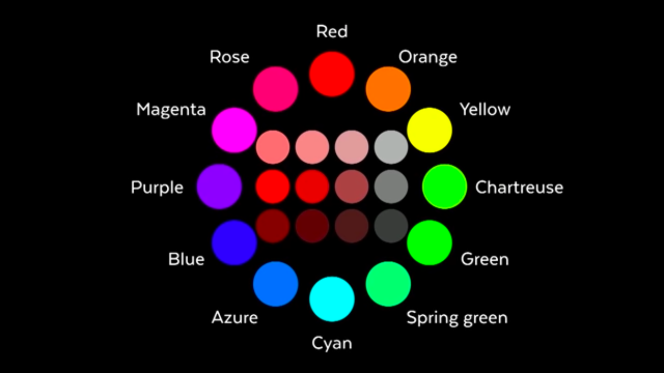 --- ### Hexadecimal 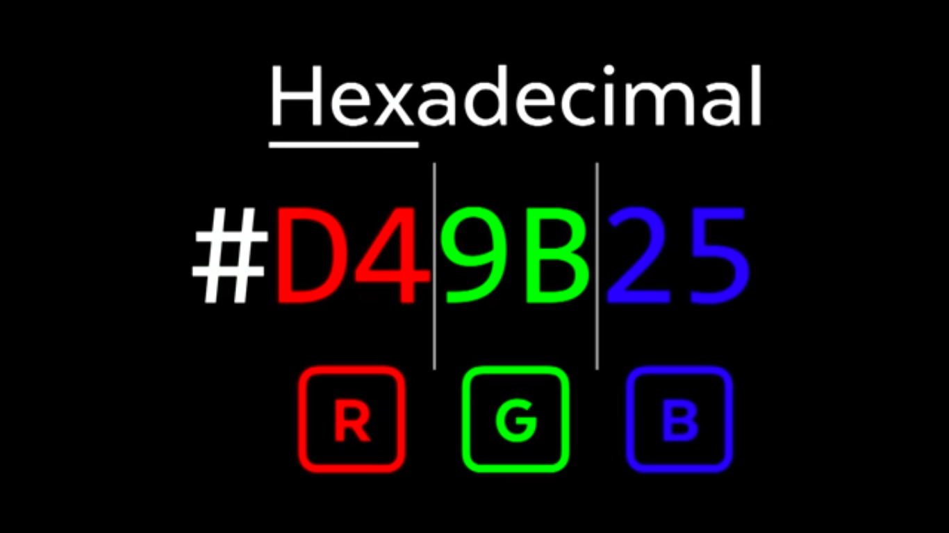 --- ### Shortcodes Takes the first third and fifth numbers only. 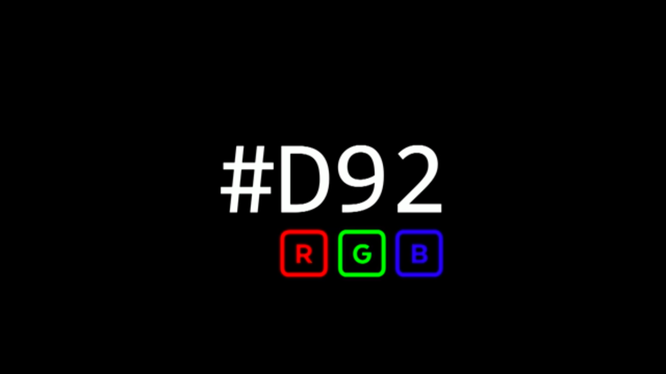 --- ### Base-16 numbers Look at the shortcode to determine colour strength. 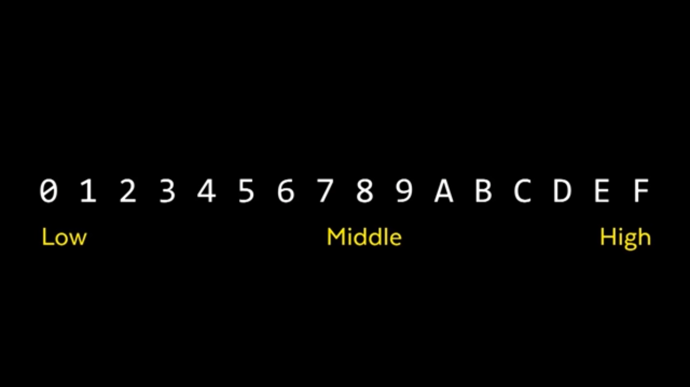 --- ### RGB and Hex RGB channels range from 1-255<br> Hex channels range from 0-f (in double digits) 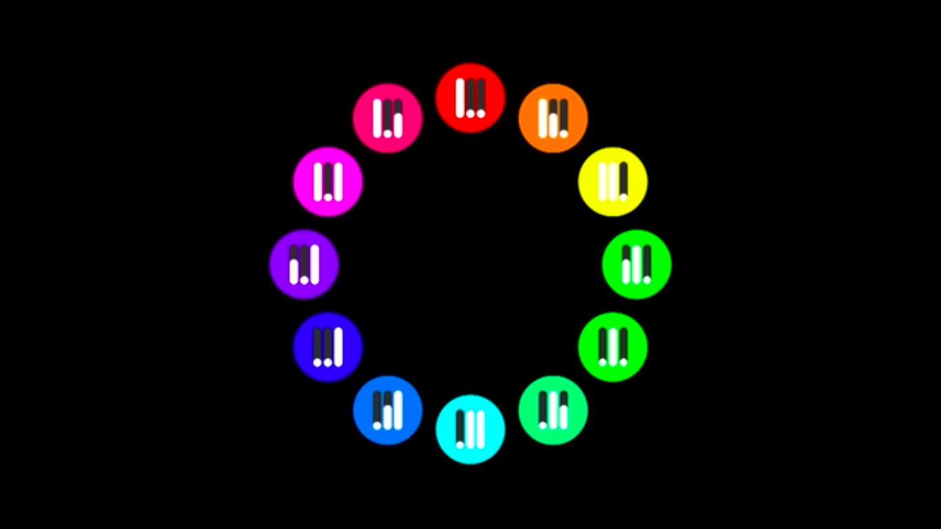 --- ### Neutral and Grays In RGB/Hex neutrals and grays contain near equal amount of each colour. This can be hard to control in code. 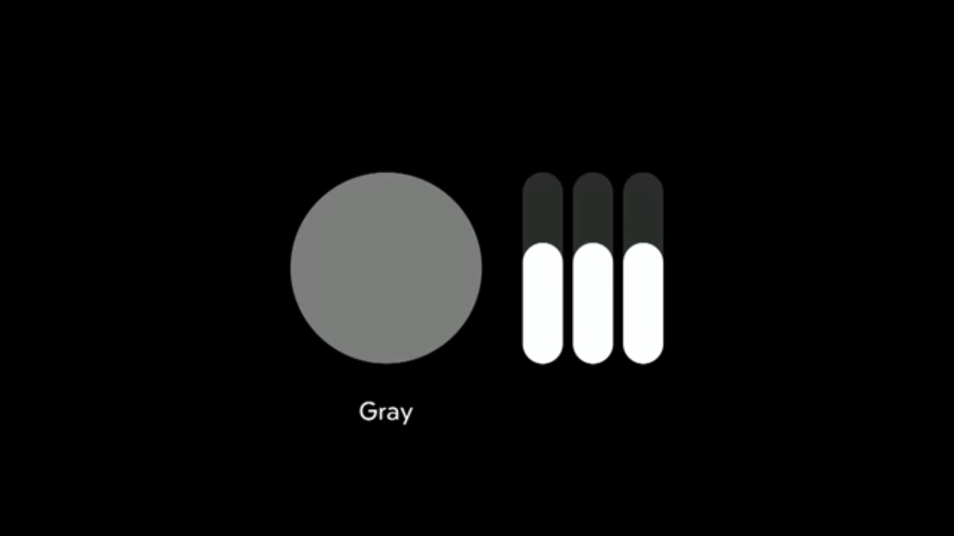 --- ### HSL - Hue, Saturation, Lightness Provides and human-friendly format that is also easily controlled with Javascript. See: [blend mode visualizer](https://acidtone.github.io/blendr/) 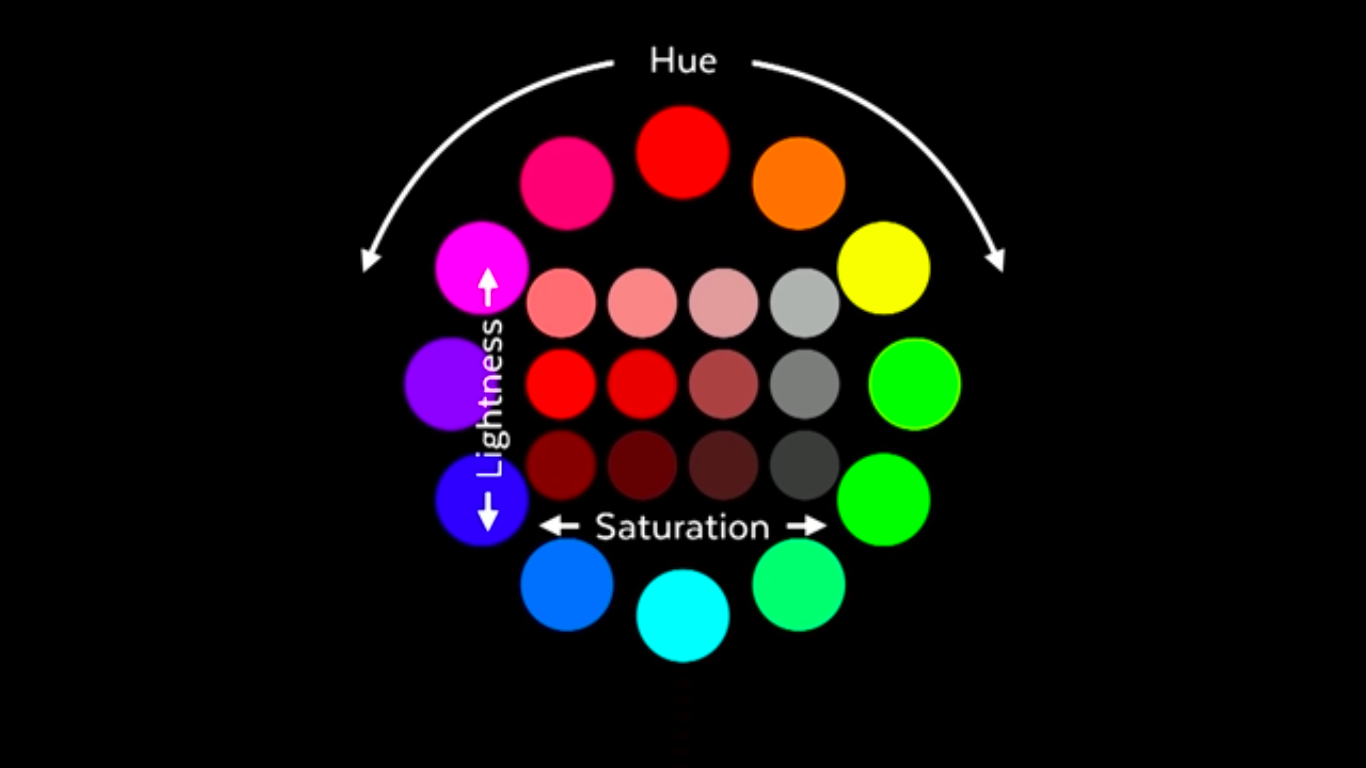 --- ### hue Measured in degrees in CSS 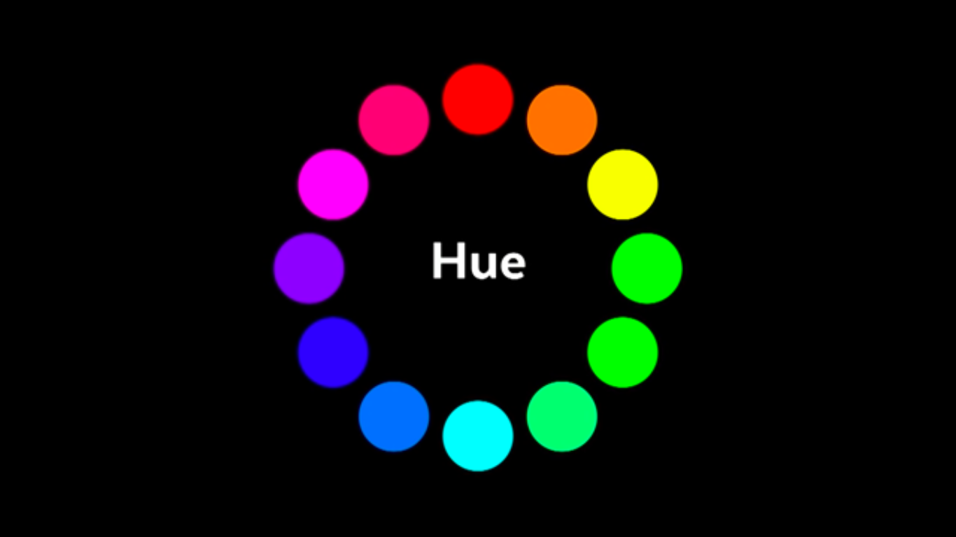 --- ### Saturation Used to make neutrals and grays 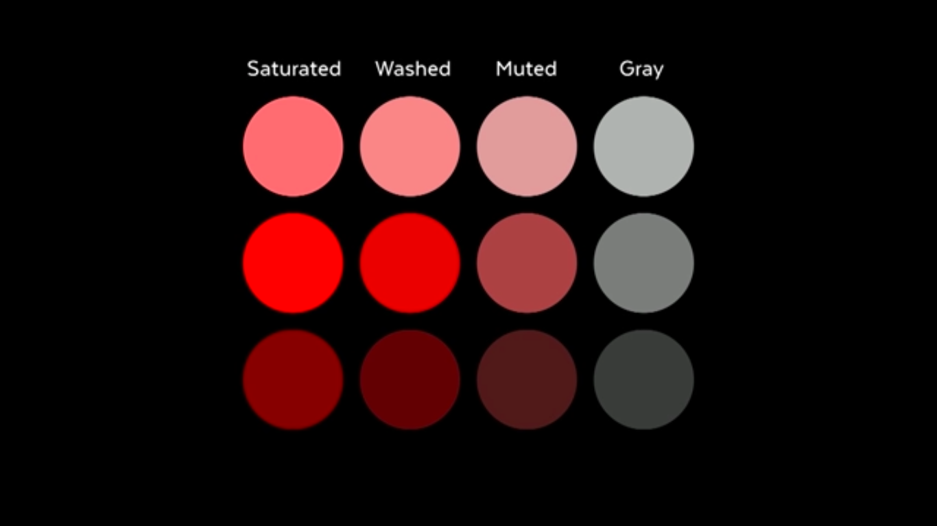 --- ### Lightness The key for predictable contrast ratios 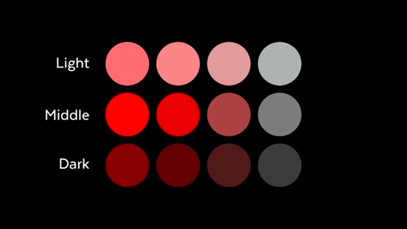 --- ## How to Use Colour in your designs - Use the [60-30-10 rule](https://www.youtube.com/watch?v=UWwNIMHFdW4) to pick: - 60% use of a **neutral** colour - 30% use of a **primary** colour - 10% use of a **call-to-action** colour - Use [colour harmonies](https://www.sarasoueidan.com/blog/hex-rgb-to-hsl/) when mixing colours; - Kevin Powell from [Give your site a fantastic color scheme fast](https://www.youtube.com/watch?v=mq8LYj6kRyE): > Start with white, black and a "punch" colour. --- ## The 60-30-10 Rule  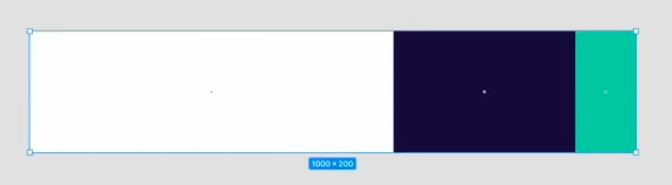 --- ### Colour Harmonies Vary hue angle to match a harmony 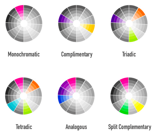 --- ## Contrast ratio - The color contrast between background and foreground content (that is, usually text) should be great enough to ensure legibility. - When designing readable interfaces for different vision capabilities, the WCAG guidelines recommend the [following contrast ratios](https://developer.mozilla.org/en-US/docs/Web/Accessibility/Understanding_WCAG/Perceivable/Color_contrast). - **Use Lightness** to ensure foreground and background colours are high enough contrast. --- ## Determining contrast ratio 1. Tony's fave [contrast ratio checker](https://contrast-ratio.com/) 2. Firefox Inspector 1. Right-click and inspect an element with text; 2. Under `Rules`, find the color declaration of the text; 3. Click on the color swatch. An info window will pop up listing.