# Flexbox Extras ## Common layout patterns --- ## Dealing with overflow You usually want to avoid horizontal overflow on a page. This is a common problem with navigation on mobile: 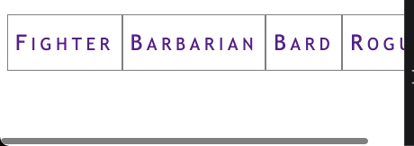 --- ## Option 1: `flex-wrap` You can wrap items with [`flex-wrap`](https://css-tricks.com/snippets/css/a-guide-to-flexbox/#aa-flex-wrap). Wrapped nav elements are sometimes difficult to work nicely with but it's better than overflow: ```css .container { display: flex; flex-wrap: wrap; /* default: nowrap */ } ``` 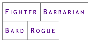 --- ## Option 2: `@media` query [Media Queries](https://css-tricks.com/a-complete-guide-to-css-media-queries/) are like if statements for CSS, based on some browser condition (i.e. screen width, but there are others): ```css .container { display: block; } @media screen and (min-width: 40em) { /* screen is larger than 40em */ .container { display: flex; } } ``` This is a **mobile-first** media query: The mobile styles come first and are overridden when the screen is larger than `40em`; --- ### Resulting Breakpoint Screen is narrower than `40em` (the default in a mobile-first design): 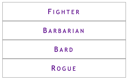 Screen is wider than `40em`:  --- ### Hamburger menus A common mobile pattern is to use a button toggle: 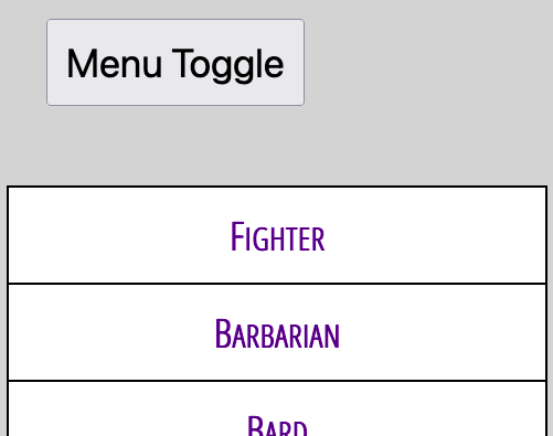 See: [Making an Accessible Hamburger Menu](http://www.ashleysheridan.co.uk/blog/Making+an+Accessible+Hamburger+Menu) by Ashley Sheridan --- ## Filling extra space The [`flex` shorthand property](https://css-tricks.com/almanac/properties/f/flex/) can be used to make items expand to fill extra space: ```css .container { display: flex; } .item { flex: auto; /* default: 0 auto */ } ``` --- ### Full-width horizontal navigation ```css nav ul { display: flex; } nav ul > * { flex: auto; } ``` All items grow to fill space  --- ### One full-width link ```html <nav> <ul> <li><a href="#">Fighter</a></li> <li class="barbarian"><a href="#">Barbarian</a></li> <li><a href="#">Bard</a></li> <li><a href="#">Rogue</a></li> </ul> </nav> ``` ```css nav ul { display: flex; } nav ul > .barbarian { flex: auto; } ``` Only `.barbarian` grows to fill space:  --- ## Sticky footers A footer that "sticks" to the bottom of a short page: 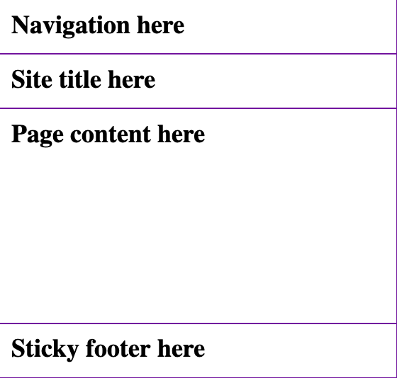 --- ### The code [Codepen demo](https://codepen.io/browsertherapy/pen/XWqZpLR) ```html <!-- HTML --> <body> <nav>Navigation here</nav> <header>Site title here</header> <main>Page content here</main> <footer>Sticky footer here</footer> </body> ``` ```css /* CSS */ body { display: flex; flex-direction: column; min-height: 100vh; /* page will scroll if it needs to */ } main { flex: auto; /* grows to fill page */ } ``` --- ## Key Takeaways - The default for flex items: ```css .item { flex: 0 auto; /* don't grow */ } ``` - Use `min-height` to force a container to be taller than short content but allow it to scroll with long content; - Flexboxes can be nested: use one in `column` direction for page layout and another in `row` (default direction) for navigation; --- ## `flex` Deep Dive The `flex` shorthand property controls: - `flex-grow`: When items grow to fill space - `flex-shrink`: When items shrink - `flex-basis`: Flex version of width (or height) See the following resources for more layout patterns using `flex`: - [Flexbox design patterns you can use in your projects](https://www.youtube.com/watch?v=vQAvjof1oe4) by Kevin Powell - Codepen: [Example code of above](https://codepen.io/browsertherapy/pen/oNYNXZO)